Product Designer
I worked on Marriott’s design system as part of the product design team, contributing to the components and patterns used across the Bonvoy app.
Bonvoy Wallet is one example of that work. It brought together visual design, reusable components, and engineering constraints to create a membership experience that feels distinct across six tiers while remaining part of one system.
Project Overview
One app, one shared system
Marriott Bonvoy brings together more than 30 hotel brands and six membership tiers in one app. A shared design system provides the foundation for consistency across brands, features, and platforms.
As a Senior Product Designer, I worked with the system across product experiences, identifying gaps and contributing new components and patterns.
Where Wallet was different
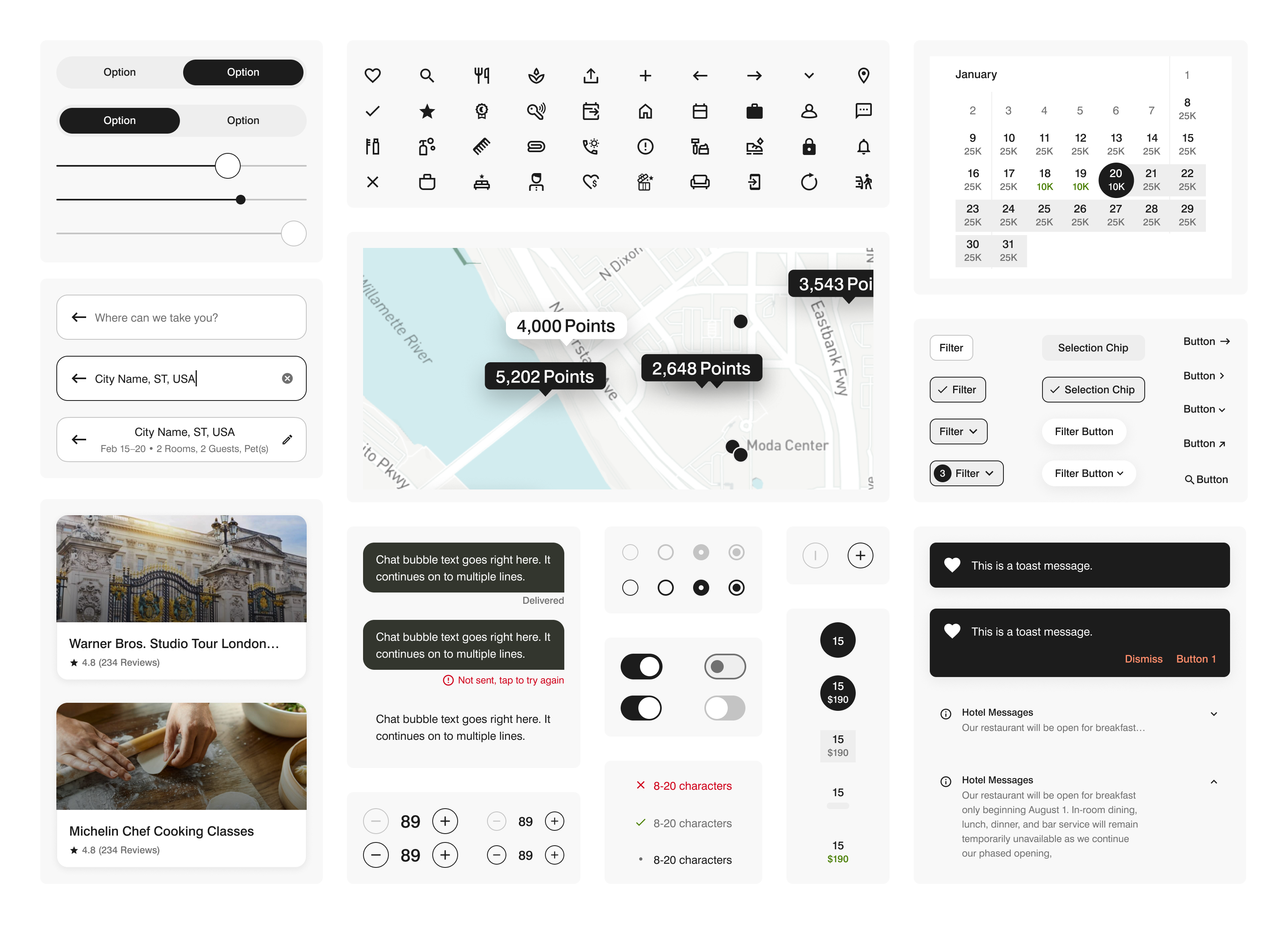
Most components were designed to be visually neutral. Wallet needed something more expressive.
A membership card needed to make status feel valuable and recognizable, while still belonging to the same design system.
The challenge was to introduce that distinction without creating a separate system.
Role
Senior Product Designer · Product Design & Design Systems
Platforms
iOS · Android
Senior Product Designer · Product Design & Design Systems
Platforms
iOS · Android
Extending the Design System
Familiar components, new responsibilities
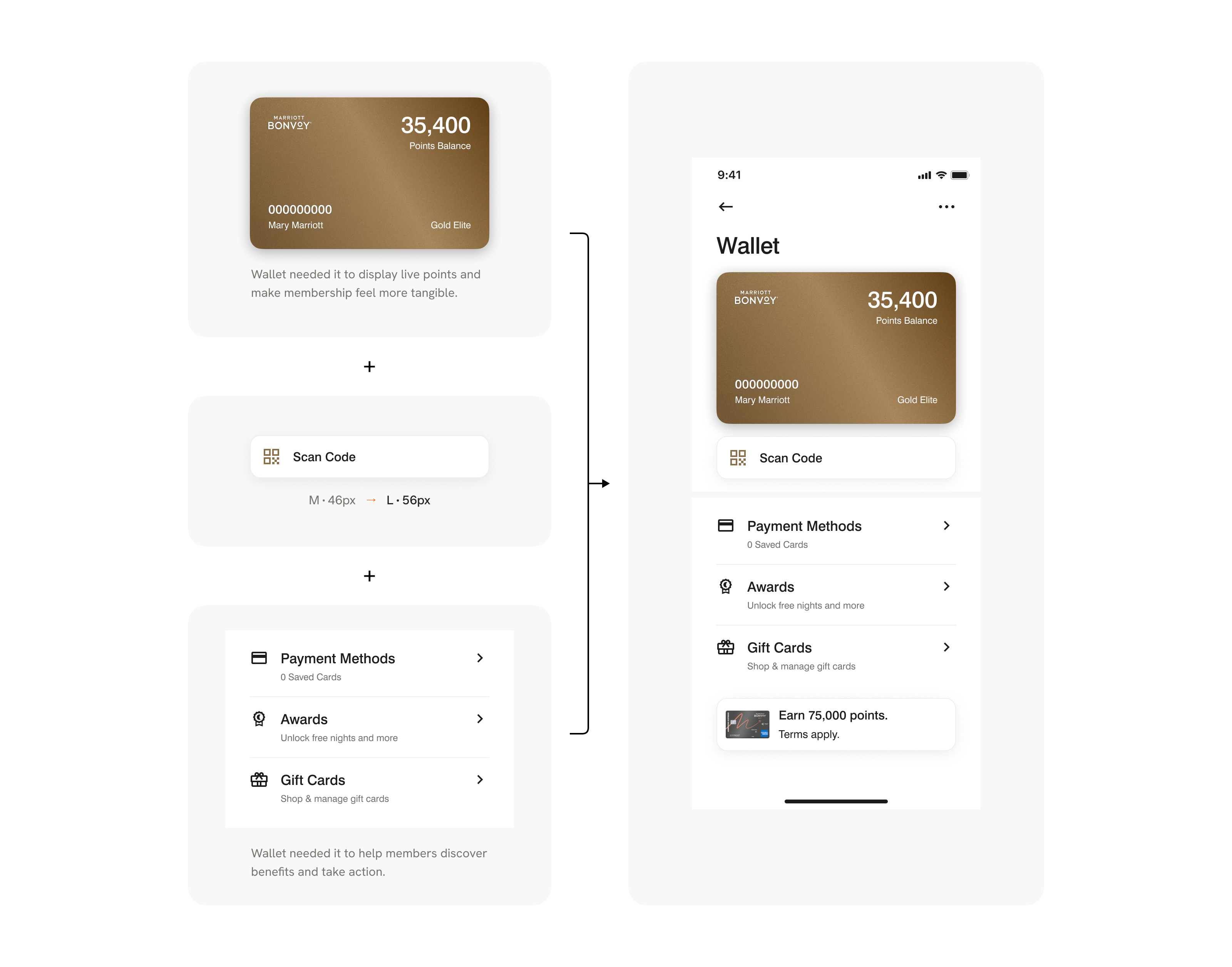
The existing system already had the building blocks Wallet needed: a card, a button, and a list.
But each had been designed for a different purpose.
Membership card
Originally designed to display membership status on a profile page. Wallet needed it to display live points and make membership feel more tangible.
Primary button
Previously used for standard navigation. Wallet needed a more prominent action to encourage members to earn and redeem points.
List
Originally designed to organize information. Wallet needed it to help members discover benefits and take action.
Building on what already existed
Rather than creating three isolated solutions, the goal was to extend existing patterns into reusable components.
Each component needed to fit within the design system, communicate its purpose clearly, and be practical for engineering to implement.
Six Tiers, One System
The accessibility challenge
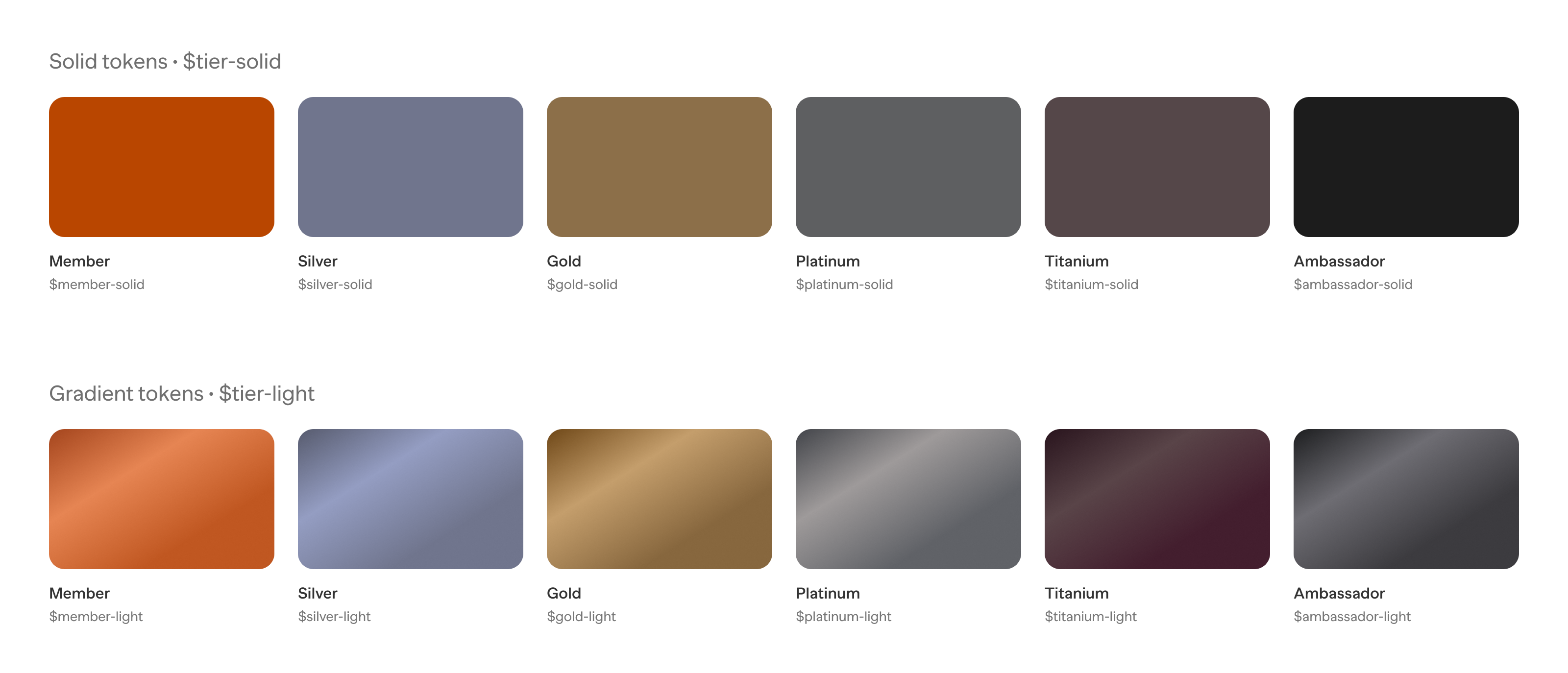
Each membership tier has an official color, from Member to Ambassador.
But several colors didn’t meet WCAG text contrast requirements when used as card backgrounds.
Lightening the colors improved contrast, but weakened their identity.
Separating color from material
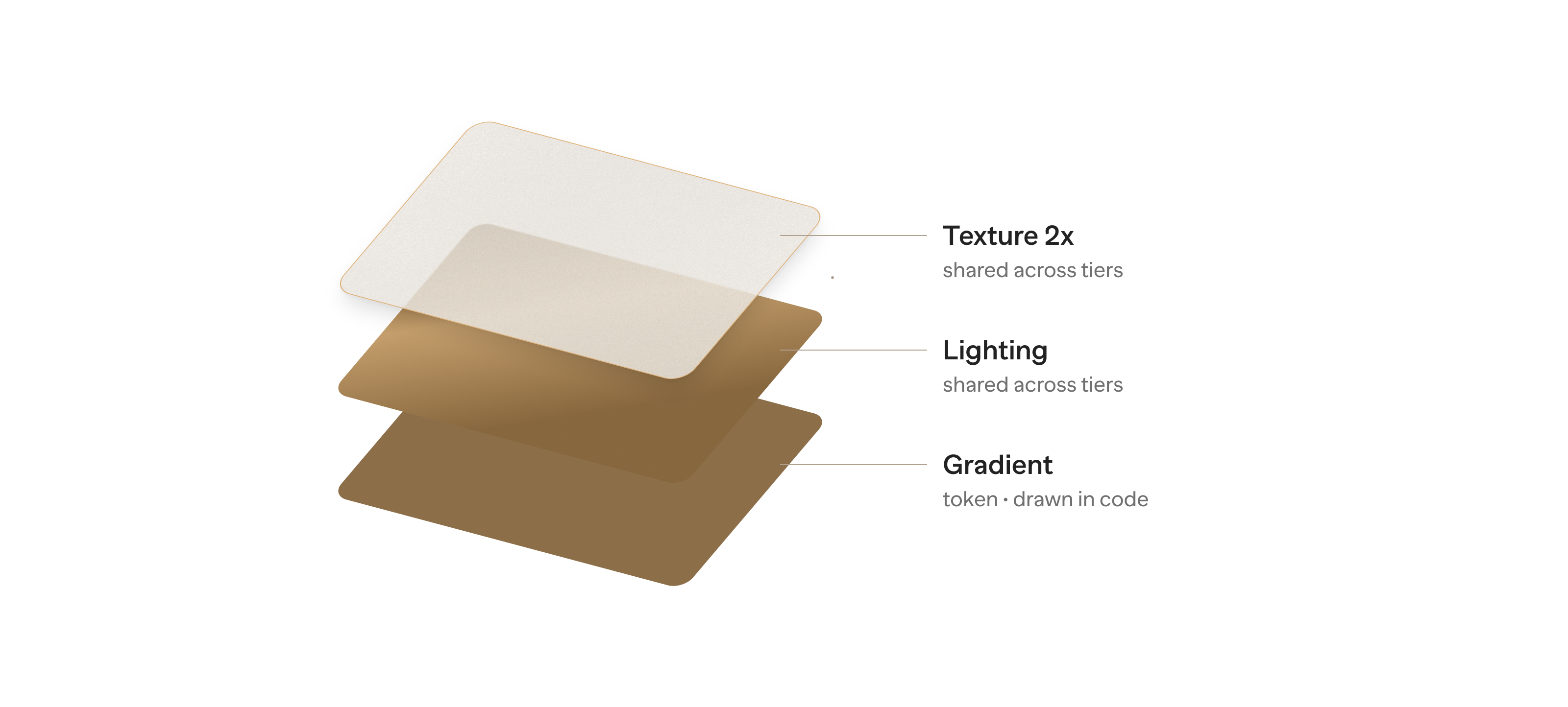
The solution was to build each card from three layers:
• Gradient: A unique color token for each membership tier.
• Lighting: A shared layer that creates depth.
• Texture: A shared layer that adds a subtle material finish.
The gradient preserves each tier’s identity, while the lighting and texture create a consistent visual language.
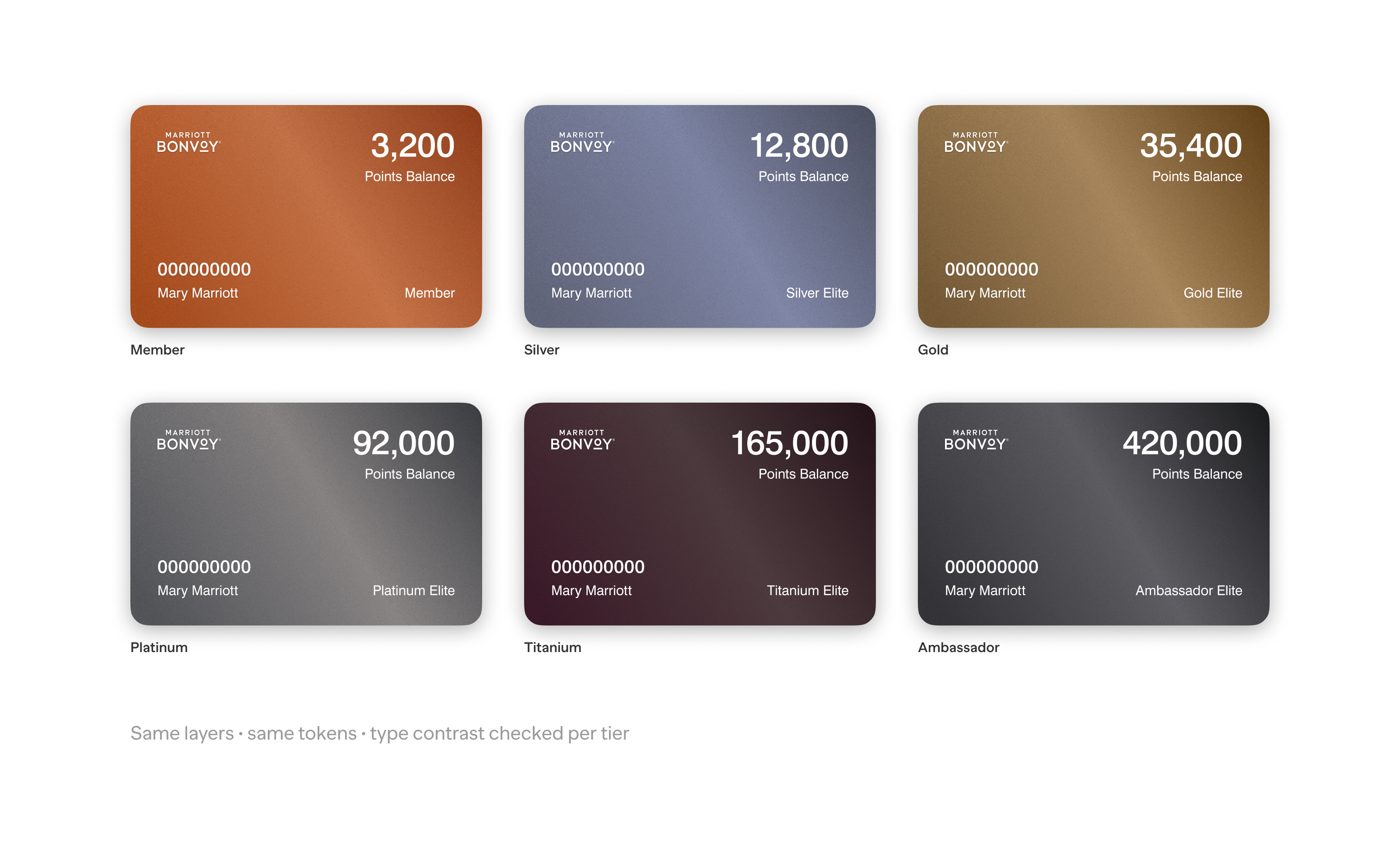
Six distinct tiers, built from the same visual rules.
The Membership Card
More than a colored rectangle
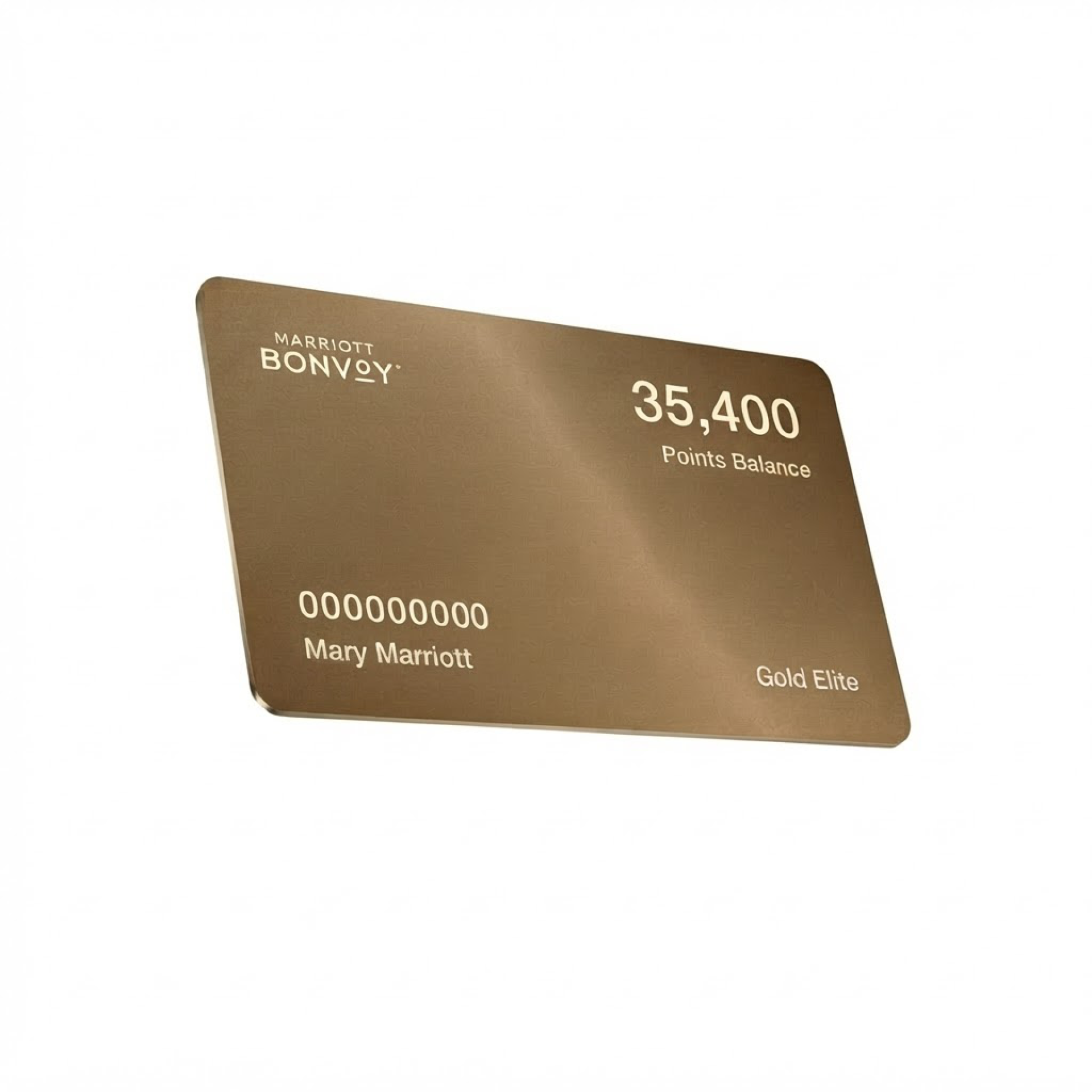
The membership card needed to feel like a physical object translated into a digital experience.
A tier-specific gradient establishes its identity. Subtle lighting adds depth, while a fine texture gives the surface a more tangible quality.
Consistency through shared layers
Only the gradient changes between tiers. The lighting and texture remain identical.
This keeps the cards visually consistent and makes the component easier to maintain.
The same structure supports light and dark modes, with text contrast evaluated for each tier.
Making the Design Shippable
The first approach was too heavy
The original handoff exported each membership card as a separate SVG, combining the gradient, lighting, and texture into one file.
The files were too large for production.
Engineering suggested removing the lighting or texture, or reducing the texture resolution. Those changes reduced file size but compromised the visual quality.
Solving the structure, not the appearance
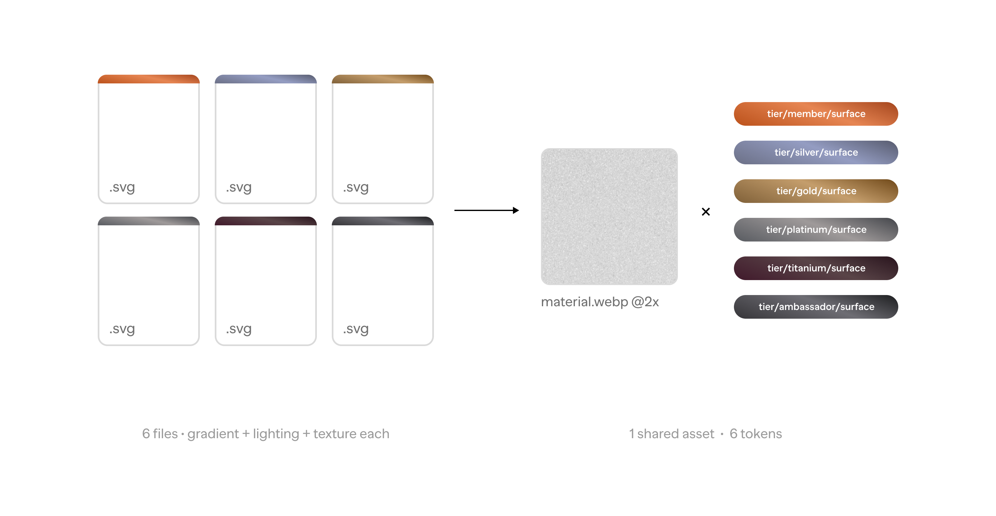
The problem wasn’t how the cards looked. It was how they were built. Instead of exporting six complete cards, the design was separated into two parts:
One shared asset: Lighting and texture combined into a grayscale image at 2× resolution.
Six gradient tokens: Tier-specific colors rendered directly in code.
This preserved the intended appearance while removing redundant assets.
One component, multiple variations
Six separate SVGs became one shared asset and six token sets.
The same structure also supports dark mode by changing token values rather than creating new assets.
Adding another tier now requires a new token, not an entirely new card.
Documentation
One source of truth
Wallet was still evolving, so the design files needed to support ongoing exploration without creating confusion during development.
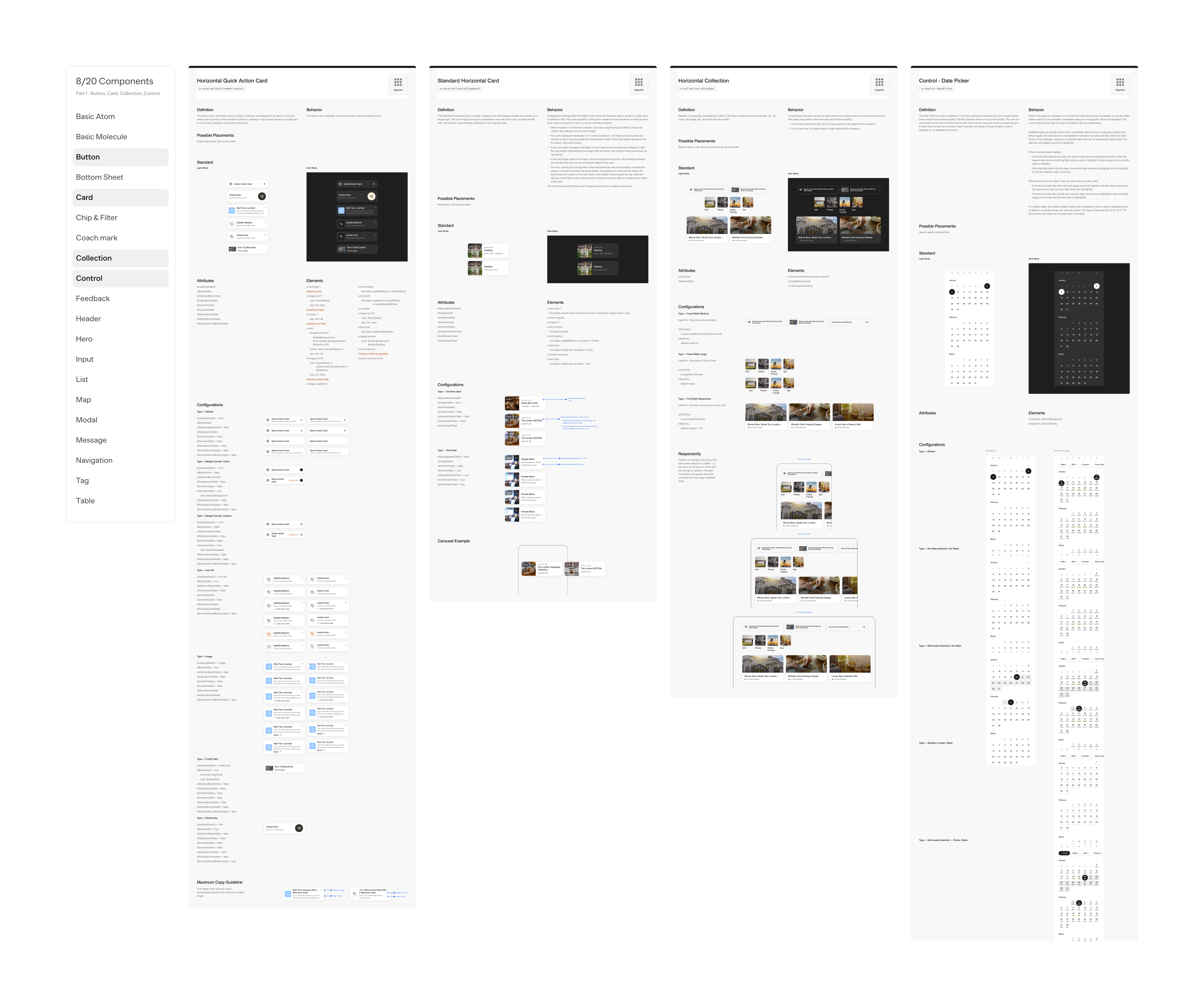
The work was organized into two separate files:
Exploration file
A flexible space for testing ideas, refining components, and exploring new directions.
Launch specification
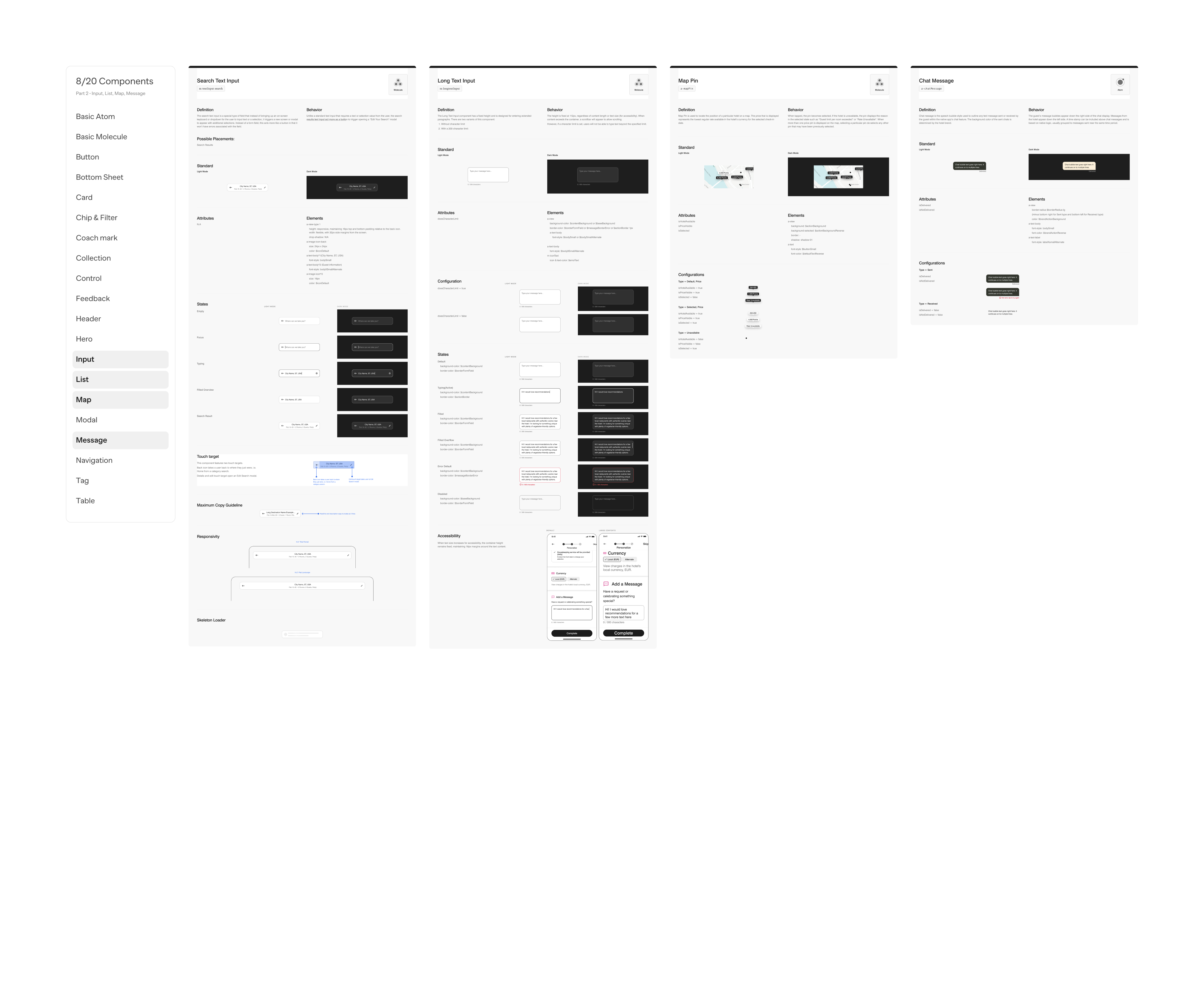
An approved reference for engineering, documenting component states, behavior, tokens, and assets.
Keeping design and engineering aligned
Once a component was approved, any changes were made directly in the launch specification and communicated to engineering.
This kept implementation aligned with the latest decisions and reduced ambiguity during development.
The specification became a shared reference for both the design and engineering teams.
Outcome
Shipped as designed
Bonvoy Wallet launched on iOS and Android with the membership card implemented exactly as designed. Nothing was removed from the visual design to get it into production.
Measured by what the system kept
Six separate card assets became one shared image and six tokens. All six tiers pass WCAG AA text contrast in both light and dark mode. Adding a seventh tier would take one new token, not a new card.
Measured by adoption
The membership card, the large button, and the tier tokens were among the first Wallet components adopted into Marriott’s design system, which serves more than 30 brands across the Bonvoy app. For a design system contribution, adoption by the system team is the clearest signal that the work was built the right way.
The result was a more expressive membership experience built on a scalable, reusable foundation.